
Ezer L’Chaim
A Ride sharing Management Dashboard

Project Overview
Role: UX Designer & Product Manager (Internship project)
Timeline: 2024 (4 months)
Collaboration: Chasdei Lev Foundation
Type: Non-profit sector, internship project
Context & Goal
Ezer L’Chaim provides volunteer-driven transportation for patients to hospitals. Until now, coordination was done manually by phone, which was time-consuming and inefficient.
The goal: create a centralized dashboard to:
Streamline ride scheduling & volunteer management
Reduce missed rides through real-time notifications
Provide managers with data visibility for donor transparency and fundraising
Process – Double Diamond
🔹 Discover
Competitor & market research → exploratory research analyzed competitors in the market, focusing on both volunteer organizations and products offering similar transportation services. The study identified key strengths and weaknesses in existing systems, highlighting the need for simpler booking processes, real-time notifications, advanced data management features, and personalized volunteer information.


2. Dashboards Best Practices → This research reviewed best practices for dashboards, emphasizing clear data visualization, interactivity, hierarchical data presentation, and consistent design. These elements are crucial for creating an effective, user-friendly management dashboard
3. Card sorting & Interviews → a quantitative study used card sorting to understand how users categorize information. The results helped define a clear, logical information hierarchy for the dashboard, aligning with users' mental models and ensuring ease of use.
Interviews with managers, volunteers, and ride requesters identified key needs: better data organization, technological resources, clear micro-copy, personal preferences for volunteers, and real-time coordination. These insights informed the design of a more intuitive and responsive management system
🔹 Define
Personas: managers (coordination + donor reporting), volunteers (availability + preferences), riders (safety + reliability)
Managers:
Need for centralized data to improve decision-making and transparency for donors.
Current system lacks technological tools for efficient management and real-time coordination.
Preference for Hebrew interface for easier navigation.
Volunteers:
Lack of location-based filters leads to missed ride opportunities.
Interface is not mobile-friendly and lacks essential integrations, like Waze.
Insufficient passenger information hinders effective ride selection.
Riders:
Challenges in finding volunteers on short notice.
Unclear communication about volunteer availability and arrival times.
Desire for regular drivers to enhance privacy and security.
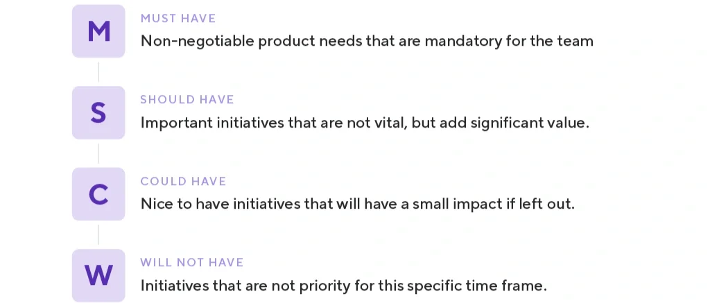
2. Data mapping & MoSCoW prioritization → must-have features: ride scheduling, real-time updates, dashboards
3. KPIs: more coordinated rides, fewer missed rides, Boost donations.
🔹 Develop
Information architecture + user flows
“As a manager at Ezer La'Chaim, I want to present key performance metrics and specific information about the organization's activities to a potential investor. To do this, I access the dashboard and select data from the last month's activities. The specific data I choose includes the number of volunteers by region and the number of completed rides during the month.”
User Journey I
User Journey II
“As a manager at Ezer La'Chaim, I want to present key performance metrics and specific information about the organization's activities to a potential investor. To do this, I access the dashboard and select data from the last month's activities. The specific data I choose includes the number of volunteers by region and the number of completed rides during the month."
Wireframe: Sketches


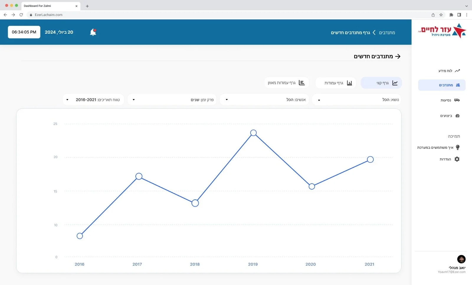
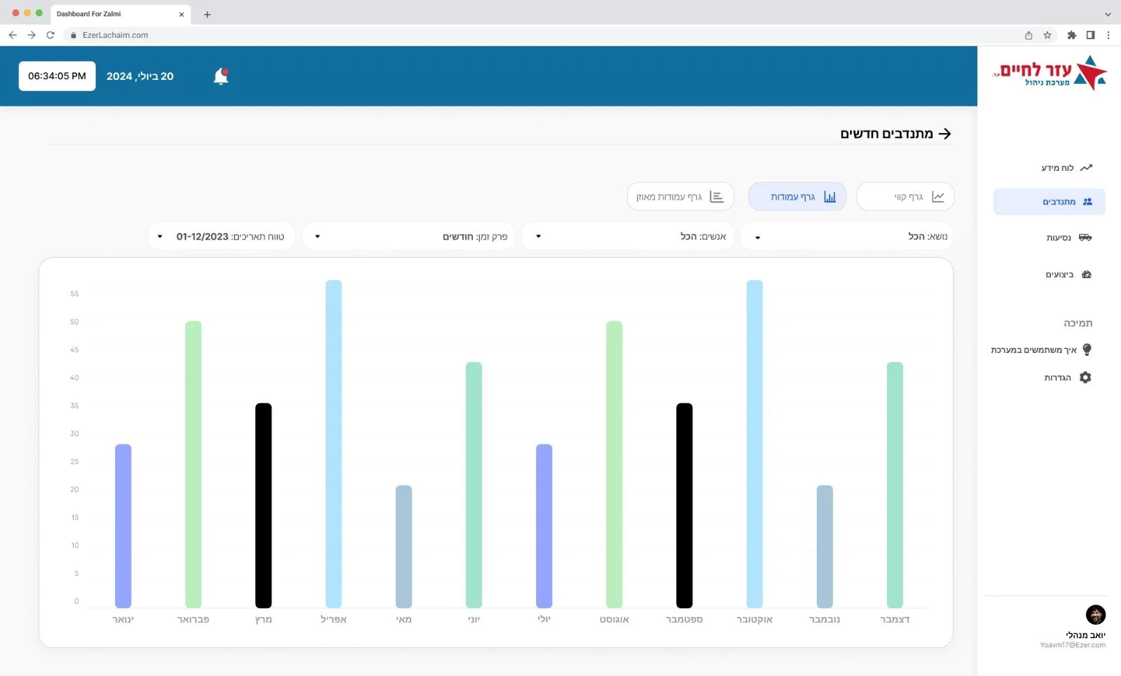
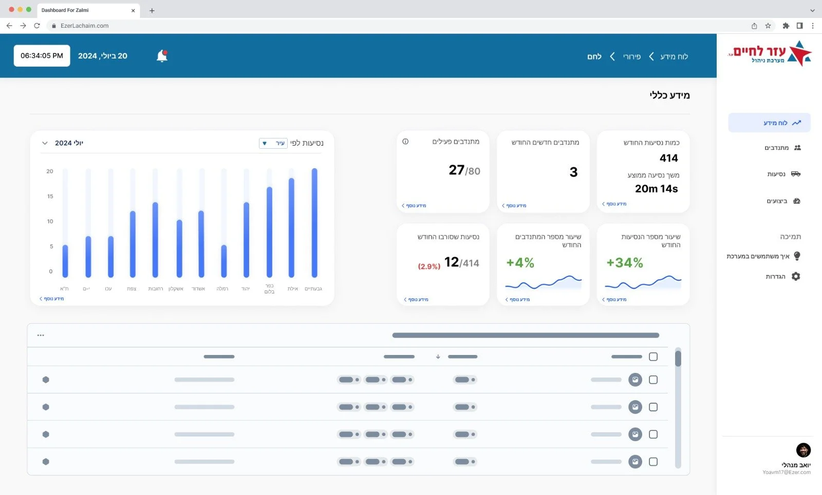
Final Design
🚗
Final Design 🚗
We focused on creating a clean, intuitive interface with professional visuals to present information optimally and make a strong impression on potential investors and donors. The main conclusions from our research highlighted the need for clear data centralization, personalized notifications, and an improved user experience through a user-friendly interface. The dashboard addresses these needs with customizable graphical displays, real-time data filtering, and continuous updates on ride and volunteer status.